Custom slides
When no built-in layout fits, write the slide’s arrangement yourself. A custom slide names its own cells by purpose, such as header, body, footer, aside, or notes. This is semantic structure: content and styling refer to what each cell means instead of where it appears.
Build a custom slide in three separate layers: define its named grid, assign content to those names, and style the labeled cells with native Typst rules. The walkthrough below grows one slide through all three. The sections after it are the reference for each layer.
Painting a cell’s own block with set block rules is new in 0.0.2, which is not on Typst Universe yet, so the snippets and examples on this page pin the development version. One command installs it — curl -fsSL https://raw.githubusercontent.com/vincentarelbundock/mosaic/main/install.sh | sh — and then it imports as:
#import "@local/mosaic:0.0.2" as mSee Install for the full instructions.
Walkthrough
One named cell
Start with one named cell and pass it to slide as the layout.
#let single = m.grids.cell("main")

#m.slide(
  layout: single,
  cells: (main: [A custom slide starts with one named cell.]),
)
Split the grid
m.grids.columns places cells side by side. Each key in cells: matches one cell ID.
#let split = m.grids.columns("main", "aside")

#m.slide(
  layout: split,
  cells: (
    main: [The main argument],
    aside: [Supporting evidence],
  ),
)
Nest splits and size tracks
Splits nest directly: rows stacks the sidebar cells, track assigns their proportions, and columns combines the sidebar with the main cell.
#let composition = m.grids.columns(
  m.grids.track(2fr, "main"),
  m.grids.track(1fr, m.grids.rows(
    m.grids.track(2fr, "notes"),
    m.grids.track(1fr, "source"),
  )),
)

#m.slide(
  layout: composition,
  cells: (
    main: [The main argument],
    notes: [Two parts notes],
    source: [One part source],
  ),
)
Add content
The grid remains unchanged while the cells: dictionary receives ordinary Typst markup: headings, lists, emphasis, figures, equations, or any custom content.
#m.slide(
  layout: composition,
  cells: (
    main: [
      == Composition

      - Name every cell.
      - Keep structure independent of content.
    ],
    notes: [
      *Evidence*

      #lorem(8)
    ],
    source: [#text(size: 0.65em)[Source: example data]],
  ),
)
Style the cells
Once the cells and content are in place, target each cell by its label. A set block rule paints the cell, while set align positions its content.
#show label("mosaic-cell-main"): set block(fill: rgb("#7fa8cc"))
#show label("mosaic-cell-main"): set align(left + horizon)
#show label("mosaic-cell-notes"): set block(fill: rgb("#85b892"))
#show label("mosaic-cell-source"): set block(fill: rgb("#c9a75e"))
See Styling cells for the full styling model.
Built-in layouts are grids too
A built-in layout resolves to a grid of named cells like any other, so the same cells: dictionary fills it. Assign one to a binding and pass it as the layout when you want a familiar structure without giving up named assignment:
#let content-layout = m.layouts.content(variant: "header-body")

#m.slide(
  layout: content-layout,
  cells: (
    header: [== Content layout],
    body: [A familiar header-and-body structure.],
  ),
)
Grids with columns() and rows()
Describe a custom grid by splitting the available space. m.grids.columns places cells side by side; m.grids.rows stacks them. Each string is a cell ID. Import Mosaic under a short alias so the grid constructors stay namespaced and native Typst columns() remains available:
#import "@local/mosaic:0.0.2" as mAssign the grid to a binding, then pass it to m.slide through layout:. The slide’s positional bodies fill the cells in source order:
#import "@local/mosaic:0.0.2" as m
#show: m.setup

// Outline each cell so the grid structure is visible. Cells are structural, so
// these are ordinary label rules rather than a grid feature.
#let outline = 1pt + luma(65%)
#show label("mosaic-slide"): set align(center + horizon)
#show label("mosaic-slide"): set text(weight: "bold")
#show label("mosaic-cell-a"): set block(stroke: outline)
#show label("mosaic-cell-b"): set block(stroke: outline)
#show label("mosaic-cell-c"): set block(stroke: outline)

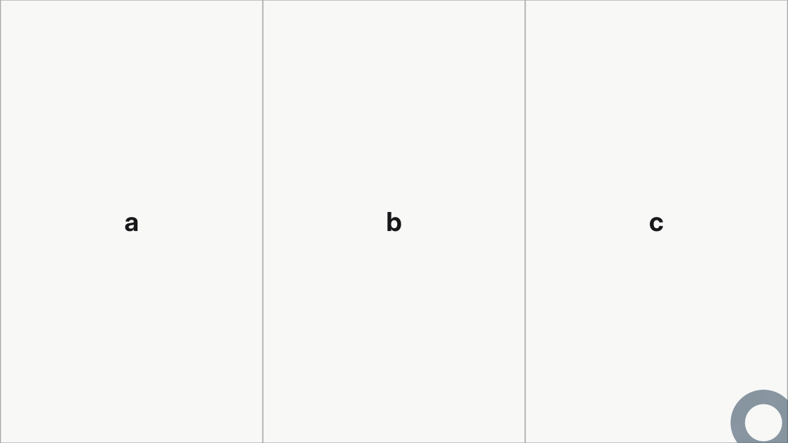
// Three strings produce three equal-width columns.
#let three-columns = m.grids.columns("a", "b", "c")

#m.slide(layout: three-columns)[a][b][c]
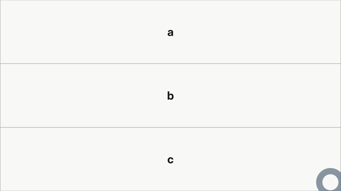
Use m.grids.rows for equal-height rows instead:
#import "@local/mosaic:0.0.2" as m
#show: m.setup

// Outline each cell so the grid structure is visible. Cells are structural, so
// these are ordinary label rules rather than a grid feature.
#let outline = 1pt + luma(65%)
#show label("mosaic-slide"): set align(center + horizon)
#show label("mosaic-slide"): set text(weight: "bold")
#show label("mosaic-cell-a"): set block(stroke: outline)
#show label("mosaic-cell-b"): set block(stroke: outline)
#show label("mosaic-cell-c"): set block(stroke: outline)

// The same three strings under v() stack into equal-height rows.
#let three-rows = m.grids.rows("a", "b", "c")

#m.slide(layout: three-rows)[a][b][c]
Each example on this page outlines its cells so the structure is visible. Those outlines are nothing but ordinary label rules, described in Styling cells: they open every listing and are no part of the grid, which is the #m.grids tree alone.
Nesting
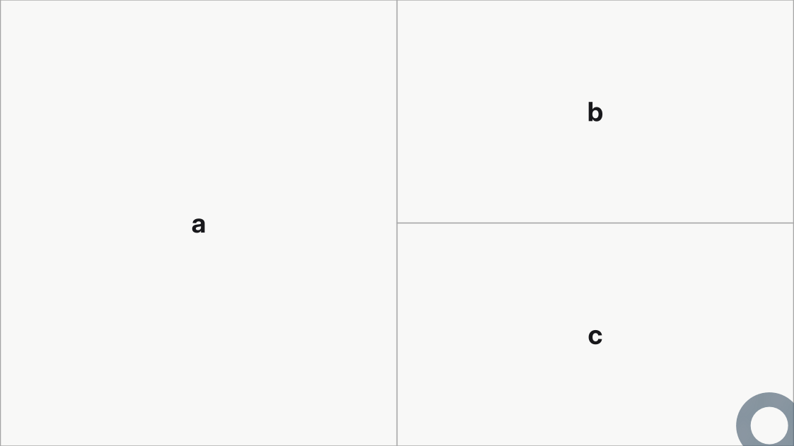
Any child of a split can be another grid, so a region can carry its own division. Here the outer columns gives a the left half and stacks b and c on the right:
#import "@local/mosaic:0.0.2" as m
#show: m.setup

// Outline each cell so the grid structure is visible. Cells are structural, so
// these are ordinary label rules rather than a grid feature.
#let outline = 1pt + luma(65%)
#show label("mosaic-slide"): set align(center + horizon)
#show label("mosaic-slide"): set text(weight: "bold")
#show label("mosaic-cell-a"): set block(stroke: outline)
#show label("mosaic-cell-b"): set block(stroke: outline)
#show label("mosaic-cell-c"): set block(stroke: outline)

// Any child can be another grid: the outer split gives "a" the left half, and
// a nested vertical split stacks "b" and "c" on the right.
#let nested = m.grids.columns("a", m.grids.rows("b", "c"))

#m.slide(layout: nested)[a][b][c]
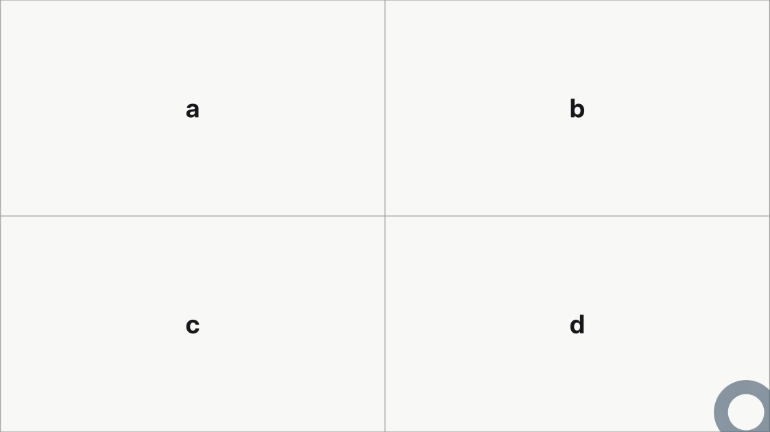
Two stacked columns splits make a 2 x 2 arrangement:
#import "@local/mosaic:0.0.2" as m
#show: m.setup

// Outline each cell so the grid structure is visible. Cells are structural, so
// these are ordinary label rules rather than a grid feature.
#let outline = 1pt + luma(65%)
#show label("mosaic-slide"): set align(center + horizon)
#show label("mosaic-slide"): set text(weight: "bold")
#show label("mosaic-cell-a"): set block(stroke: outline)
#show label("mosaic-cell-b"): set block(stroke: outline)
#show label("mosaic-cell-c"): set block(stroke: outline)
#show label("mosaic-cell-d"): set block(stroke: outline)

// Two stacked columns() splits make a 2 x 2 arrangement.
#let quadrants = m.grids.rows(
  m.grids.columns("a", "b"),
  m.grids.columns("c", "d"),
)

#m.slide(layout: quadrants)[a][b][c][d]
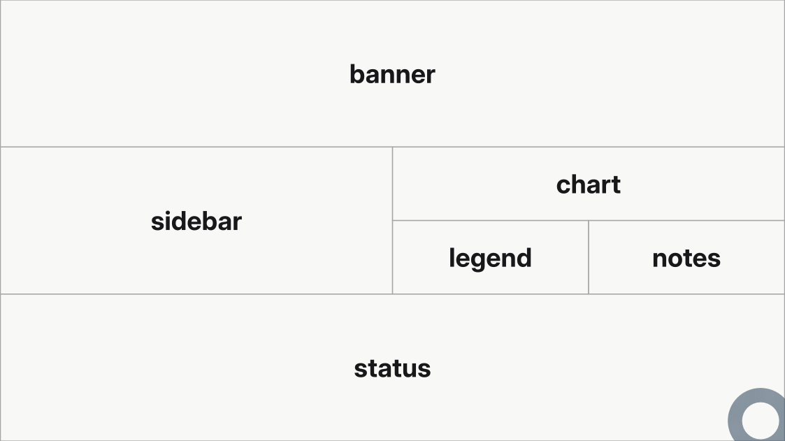
Splits nest to any depth. Read a grid from the outside inward: choose the largest split first, then replace any child that needs another division with a nested columns or rows. Keep descriptive IDs and indentation so the tree stays visible in source:
#import "@local/mosaic:0.0.2" as m
#show: m.setup

// Outline each cell so the grid structure is visible. Cells are structural, so
// these are ordinary label rules rather than a grid feature.
#let outline = 1pt + luma(65%)
#show label("mosaic-slide"): set align(center + horizon)
#show label("mosaic-slide"): set text(weight: "bold")
#show label("mosaic-cell-banner"): set block(stroke: outline)
#show label("mosaic-cell-sidebar"): set block(stroke: outline)
#show label("mosaic-cell-chart"): set block(stroke: outline)
#show label("mosaic-cell-legend"): set block(stroke: outline)
#show label("mosaic-cell-notes"): set block(stroke: outline)
#show label("mosaic-cell-status"): set block(stroke: outline)

// Splits nest to any depth. Read it from the outside inward: three bands, then
// the middle band divides again, and its right side divides once more.
#let dashboard = m.grids.rows(
  "banner",
  m.grids.columns(
    "sidebar",
    m.grids.rows("chart", m.grids.columns("legend", "notes")),
  ),
  "status",
)

#m.slide(layout: dashboard)[banner][sidebar][chart][legend][notes][status]
Grid sizes (tracks)
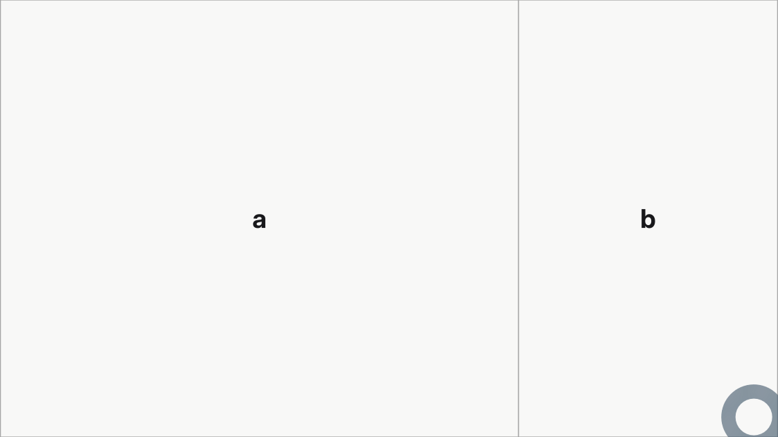
By default, every direct child of m.grids.columns or m.grids.rows receives a 1fr track. Wrap a child with m.grids.track when it needs another size:
#import "@local/mosaic:0.0.2" as m
#show: m.setup

// Outline each cell so the grid structure is visible. Cells are structural, so
// these are ordinary label rules rather than a grid feature.
#let outline = 1pt + luma(65%)
#show label("mosaic-slide"): set align(center + horizon)
#show label("mosaic-slide"): set text(weight: "bold")
#show label("mosaic-cell-a"): set block(stroke: outline)
#show label("mosaic-cell-b"): set block(stroke: outline)

// track() sizes one child: "a" takes two thirds of the width, "b" keeps the
// default 1fr and receives the rest.
#let two-thirds = m.grids.columns(m.grids.track(2fr, "a"), "b")

#m.slide(layout: two-thirds)[a][b]
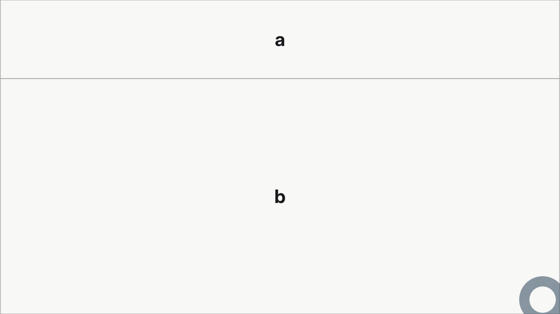
Tracks accept native auto, fixed lengths, percentages, and fr values:
#import "@local/mosaic:0.0.2" as m
#show: m.setup

// Outline each cell so the grid structure is visible. Cells are structural, so
// these are ordinary label rules rather than a grid feature.
#let outline = 1pt + luma(65%)
#show label("mosaic-slide"): set align(center + horizon)
#show label("mosaic-slide"): set text(weight: "bold")
#show label("mosaic-cell-a"): set block(stroke: outline)
#show label("mosaic-cell-b"): set block(stroke: outline)

// Tracks accept percentages and fixed lengths too: a 25% banner over a body
// that takes the remaining height.
#let banner = m.grids.rows(m.grids.track(25%, "a"), "b")

#m.slide(layout: banner)[a][b]
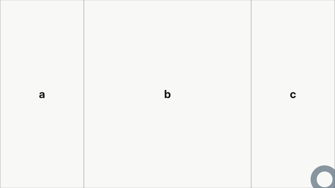
Fractions compose, so three tracks can center a double-width column:
#import "@local/mosaic:0.0.2" as m
#show: m.setup

// Outline each cell so the grid structure is visible. Cells are structural, so
// these are ordinary label rules rather than a grid feature.
#let outline = 1pt + luma(65%)
#show label("mosaic-slide"): set align(center + horizon)
#show label("mosaic-slide"): set text(weight: "bold")
#show label("mosaic-cell-a"): set block(stroke: outline)
#show label("mosaic-cell-b"): set block(stroke: outline)
#show label("mosaic-cell-c"): set block(stroke: outline)

// Fractions compose: 1fr + 2fr + 1fr centers a double-width column.
#let center-stage = m.grids.columns(
  m.grids.track(1fr, "a"),
  m.grids.track(2fr, "b"),
  m.grids.track(1fr, "c"),
)

#m.slide(layout: center-stage)[a][b][c]
The Grid API lists the exact accepted forms and their diagnostics.
Filling cells
A slide accepts cell content in two distinct forms. Use positional content blocks ([...][...]) for a short grid whose traversal order is obvious, or use the named cells: dictionary to assign content by cell ID. Do not mix the two forms in one slide. Both forms work for a custom grid and for a built-in layout alike.
Positional content with [][]
Place content blocks directly after the m.slide(...) call. Each pair of brackets is one positional body: [a][b][c] supplies three bodies. Mosaic matches them to cell IDs in source order, left to right within columns, top to bottom within rows, and recursively through nested grids.
#m.slide(layout: m.grids.columns("a", "b", "c"))[a][b][c]#import "@local/mosaic:0.0.2" as m
#show: m.setup
#set text(size: 22pt)
// Cells are structural. Give each panel a shared look by targeting its stable
// <mosaic-cell-ID> label with ordinary Typst rules.
#let panel(id) = it => {
show label("mosaic-cell-" + id): set align(center + horizon)
show label("mosaic-cell-" + id): set text(size: 1.5em, weight: "bold")
show label("mosaic-cell-" + id): set block(stroke: 1pt + black)
it
}
#show: panel("a")
#show: panel("b")
#show: panel("c")
#show: panel("d")
// Slide 1
#m.slide(layout: m.grids.columns("a", "b", "c"))[a][b][c]
// Slide 2
#m.slide(layout: m.grids.rows("a", "b"))[a][b]
// Slide 3
#m.slide(layout: m.grids.rows(
"a",
m.grids.columns("b", "c"),
"d",
))[a][b][c][d]

This compact form is especially useful for a one-cell slide. In a larger or reusable grid, positional meaning can become hard to see after the grid changes.
Named content with cells:
Pass a dictionary to the named cells: argument to associate each body with an explicit cell ID. Assignment then remains independent of the grid’s traversal order. In the example below the same IDs also anchor the styling: one show rule per cell label tints each cell, which is why the grid structure stays visible in the rendered slide.
#import "@local/mosaic:0.0.2" as m

#show: m.setup

// Styling follows cell IDs, just like named content assignment.
#show label("mosaic-cell-heading"): set block(fill: rgb("#e8f1fb"))
#show label("mosaic-cell-left"): set block(fill: rgb("#e8f5ec"))
#show label("mosaic-cell-right"): set block(fill: rgb("#f7f0dd"))
#show label("mosaic-cell-heading"): set align(center + horizon)
#show label("mosaic-cell-left"): set align(center + horizon)
#show label("mosaic-cell-right"): set align(center + horizon)

#let comparison = m.grids.columns(
  m.grids.rows("heading", "left"),
  "right",
)

#m.slide(
  layout: comparison,
  cells: (
    heading: [Heading],
    left: [Left argument],
    right: [Right argument],
  ),
)

The cell ID connects all three layers: m.grids.cell("body") defines the cell, cells: (body: [...]) fills it, and label("mosaic-cell-body") styles it. Content-bearing cells are optional and resolve to empty content when omitted; unknown IDs are errors.
Fixed cell content
When a grid owns fixed content such as an image or logo, put it directly on the cell. Fixed cell content needs no positional body or cells: entry:
#m.grids.cell("logo", content: image("logo.svg"))Refine a layout
Any named argument slide does not recognize is a field of the selected layout. So a single slide can change one aspect of the configured layout without restating it:
#m.slide(layout: "title", variant: "academic")
#m.slide(layout: "section", number: [03])[Methods]
#m.slide(layout: "image", variant: "right", image: path("fig/photo.jpg"))[== Title][Body]
#m.slide(columns: 2)[== Comparison][Left column][Right column]
This differs from passing m.layouts.title(variant: "academic"), which replaces the configured layout. Named arguments refine it: whatever the theme or m.setup set for that layout, such as an accent color or a background image, survives. Only the fields you name change.
The two forms are mutually exclusive on one slide. With an explicit m.layouts.* value, pass the fields to that constructor instead:
// Refines the configured title layout.
#m.slide(layout: "title", variant: "academic")

// Replaces it; the fields go to the constructor.
#m.slide(layout: m.layouts.title(variant: "academic"))
Field names are checked against the selected layout, so m.slide(layout: "title", columns: 2) fails at compile time rather than being silently ignored. Fields also require a layout chosen by name: if m.setup configures that layout as a raw grid rather than an m.layouts.* value, there are no fields to refine and Mosaic says so. The Layouts API lists the fields each layout accepts.
Replace or reuse a layout
To replace a named layout throughout a deck, configure it once in m.setup:
#show: m.setup.with(layouts: (
  section: m.layouts.section(variant: "image-background", image: "chapter.jpg"),
))
A custom grid goes in the same place, so a deck can send every == slide through a composition of your own:
#show: m.setup.with(layouts: (content: composition))To reuse a layout for selected slides instead, bind it with m.slide.with:
#let myslide = m.slide.with(
  layout: m.layouts.content(
    variant: "header-body",
  ),
)

#myslide(cells: (header: [== Slide title], body: [Slide content]))
What cells hold
A cell does not resize its content: a body larger than its cell is drawn past the edge. Overflow and fitting covers how to detect that and how m.fit scales one block into the space its cell gives it.
Cells hold ordinary Typst content. The Content section collects what most often goes inside them: images, the reusable m.components library, and math.