Styling cells
As the anatomy page shows, every part of a slide is a native Typst layer carrying a label, and you style all of it with ordinary set and show rules. Every rule a slide renders with comes from its theme: Mosaic’s engine contributes page geometry, deck information, and colors, but no slide typography of its own. Rules you write after m.setup layer on top of the theme’s. There is no separate styling system to learn.
Behind that, the engine keeps exactly one record of its own: the deck record, written once by m.setup and never changed afterward. It holds what you declare there, structure and geometry, plus the semantic colors and roles. Those colors are the one deliberate exception to “everything is a rule”: components are functions, and no native rule can carry a surface fill or an accent color into a function call the way set text carries typography into text. Declaring six colors and a role palette at setup is the whole extent of it.
Deck typography
Place native Typst text and heading rules after m.setup so they apply across the deck:
#show: m.setup
#set text(font: "EB Garamond", size: 26pt)
#show heading.where(depth: 1): set text(font: "Inter", weight: "black")
#show heading.where(depth: 2): set text(size: 1.4em)
A semantic heading feeds outlines, bookmarks, and content slides. Use text directly for display type that should not appear in navigation, or exclude the heading:
#text(size: 60pt, weight: "black")[BOLD]
#heading(outlined: false, bookmarked: false)[Aside]
Leading, lists, and captions remain native par, list, enum, terms, and figure.caption styling.
A heading cannot be placed inside a step command (m.steps.on, m.steps.reveal, m.steps.replace, or m.steps.drawing); keep it structurally stable across a slide’s frames.
Everything about the deck’s palette, overriding entries, the bundled palette collection, and inverting a slide, lives on the Colors page.
Styling cells
Target a cell by its label. Font, size, color, and alignment are set text, set par, and set align; the cell’s own fill, stroke, and corner radius are set block on the same label. The label reference lists every label a slide emits:
Painting a cell’s own block with set block rules is new in 0.0.2, which is not on Typst Universe yet, so the snippets and examples on this page pin the development version. One command installs it — curl -fsSL https://raw.githubusercontent.com/vincentarelbundock/mosaic/main/install.sh | sh — and then it imports as:
#import "@local/mosaic:0.0.2" as mSee Install for the full instructions.
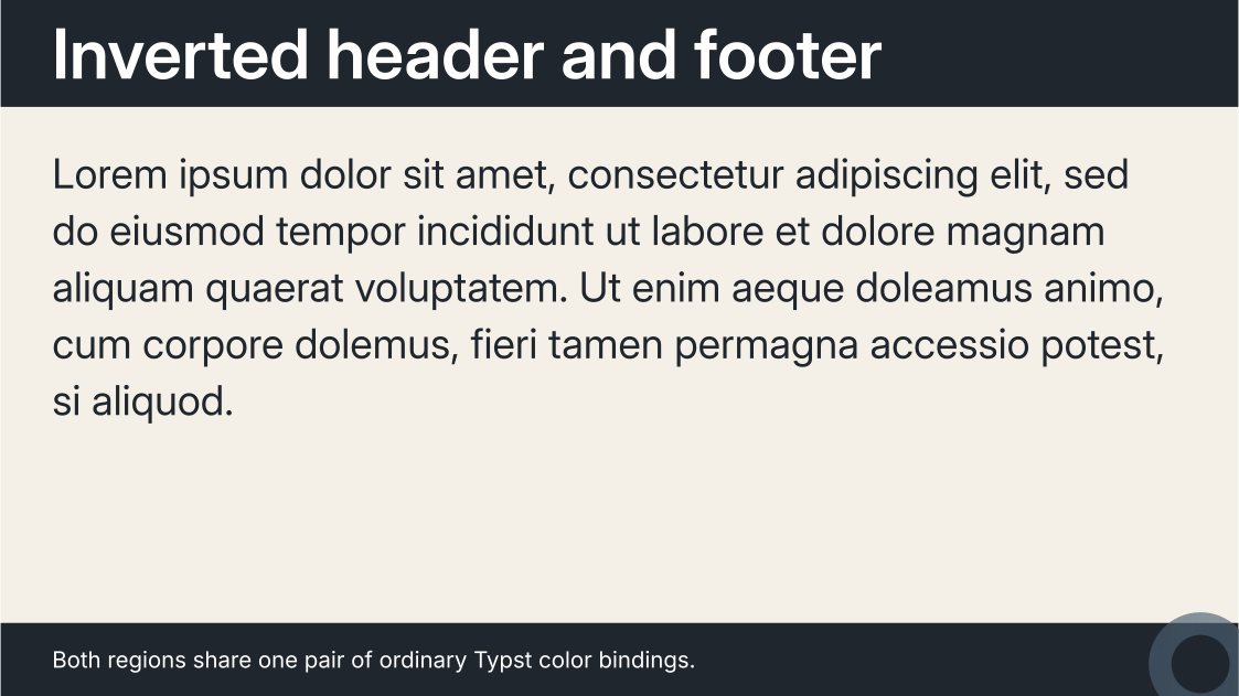
#let ink = rgb("#20262d")

#show label("mosaic-cell-header"): set text(fill: white)
#show label("mosaic-cell-header"): set block(fill: ink)
#show label("mosaic-cell-footer"): set text(fill: white)
#show label("mosaic-cell-footer"): set block(fill: ink)

#m.slide(layout: m.layouts.content())[
  == Inverted header and footer
][
  #lorem(36)
][
  Both regions share one pair of ordinary Typst color bindings.
]#import "@local/mosaic:0.0.2" as m
#show: m.setup
#set page(fill: rgb("#f4f0e8"))
#set text(fill: rgb("#20262d"))
// Two rules per cell: one for the text inside it, one for the block around it.
// Header and footer sit in `auto` tracks, so the paint takes `height: auto`
// and hugs the line each one carries.
#let ink = rgb("#20262d")
#let paper = white
#show label("mosaic-cell-header"): set text(fill: paper)
#show label("mosaic-cell-header"): set block(fill: ink)
#show label("mosaic-cell-footer"): set text(fill: paper)
#show label("mosaic-cell-footer"): set block(fill: ink)
#let myslide = m.slide.with(
layout: m.layouts.content(),
)
#myslide[
== Inverted header and footer
][
#lorem(36)
][
Both regions share one pair of ordinary Typst color bindings.
]
Content rules and block rules
Two kinds of rules cover a cell, split by what they touch. Properties of the content inside the cell (text, alignment, paragraphs, lists) pass through the label as ordinary set rules. Properties of the cell’s own block (fill, stroke, corner radius) are set block rules on the same label, and Mosaic confines them to the cell’s own surface, so blocks inside the content — code listings, cards, quotes — keep their own paint:
#show label("mosaic-cell-body"): set text(size: 0.9em)
#show label("mosaic-cell-body"): set block(fill: white)
There is no height to manage: the engine sizes the cell’s block to its track, so a cell in a 1fr or fixed track paints edge to edge and a cell in an auto track paints as tall as its content. The content layout’s header and footer are auto tracks.
The full-slide planes carry the labels <mosaic-background> and <mosaic-foreground>, so the same two kinds of rules style them as well. The one structural setting that lives on the cell itself is inset, because padding affects layout measurement:
#m.grids.cell("image", inset: 0pt)Rules after #show: m.setup override the baseline deck-wide. Scope a set rule and slide inside a block to change only that slide:
#[
  #show label("mosaic-cell-body"): set align(center + horizon)
  #m.slide[Centered for this slide only]
]
The same scoped block builds one-off slides. To show one large number or phrase on an otherwise empty slide, center the body cell and set the text size:
#[
  #show label("mosaic-cell-body"): set align(center + horizon)
  #m.slide(cells: (body: text(size: 6em, weight: "bold")[15 000 000]))
]
For a slide that shows a picture on a black background, paint the background plane through its label and center the image in the background entry:
#[
  #show label("mosaic-background"): set block(fill: black)
  #m.slide(
    cells: (
      body: [],
    ),
    background: align(center + horizon, image("fig/logo.png", height: 100%, fit: "contain")),
  )
]
Scoping a fill to one slide
Because the cell’s own block obeys set block rules, a fill, stroke, or corner radius follows the same precedence as every other set rule: declare the deck-wide baseline once, and scope an override inside a block to change exactly one slide.
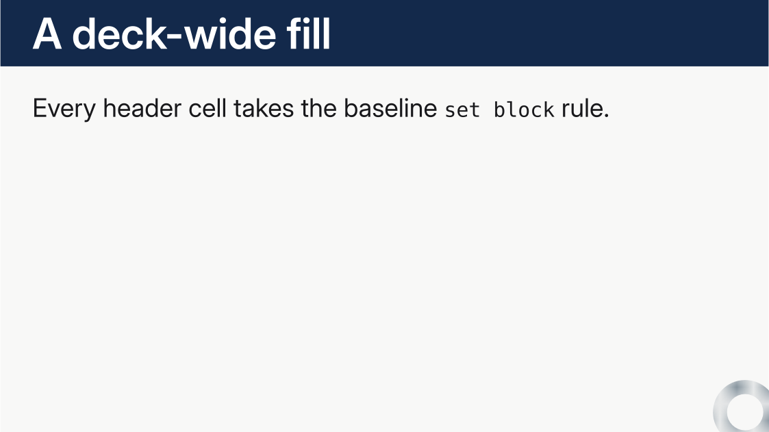
#show label("mosaic-cell-header"): set block(fill: rgb("#13294b"))
#show label("mosaic-cell-header"): set text(fill: white)

#m.slide[== A deck-wide fill][Every header takes the baseline rule.]

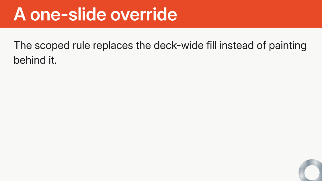
#[
  #show label("mosaic-cell-header"): set block(fill: rgb("#e84a27"))
  #m.slide[== A one-slide override][Only this slide changes.]
]#import "@local/mosaic:0.0.2" as m
#show: m.setup
// Deck-wide baseline: one native block rule fills every header cell, and a
// text rule keeps the type legible on it.
#show label("mosaic-cell-header"): set block(fill: rgb("#13294b"))
#show label("mosaic-cell-header"): set text(fill: white)
#m.slide[
== A deck-wide fill
][
Every header cell takes the baseline `set block` rule.
]
// A rule scoped inside a block overrides the baseline for exactly the slides
// in the block, following ordinary set-rule precedence.
#[
#show label("mosaic-cell-header"): set block(fill: rgb("#e84a27"))
#m.slide[
== A one-slide override
][
The scoped rule replaces the deck-wide fill instead of painting behind it.
]
]
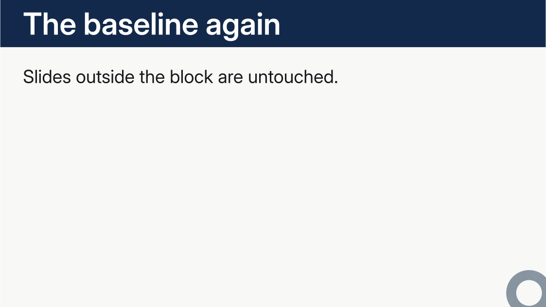
#m.slide[
== The baseline again
][
Slides outside the block are untouched.
]
The few surfaces a layout variant paints itself — the panel title variant’s ink panel, for instance — are that variant’s design and sit above label rules; when the arrangement is wrong for your content, pick another variant or draw the slide as an ordinary grid of cells.
Properties an element pins on itself
A label rule styles a region, and its set values flow inward to everything the region contains — until an element inside restates the property. A == header title is a real heading, and heading typography is restated at the heading element: Typst’s own defaults make headings bold, and a theme’s show heading rules adjust that (Metropolis sets depth-2 headings to weight: "regular"). Both sit closer to the glyphs than any rule on the surrounding cell label, so for those properties the label’s value never lands. This is ordinary Typst rather than a Mosaic rule — no label rule can un-bold a heading in any document — and it is why one half of a label rule can work while the other half is silently overridden: properties nothing inside restates, such as the header’s text fill, flow through untouched.
Restyle a pinned property at the element’s own altitude, with a rule placed after m.setup so it lands later than the theme’s:
#show label("mosaic-cell-header"): set text(fill: white)      // fill flows in through the label
#show heading.where(depth: 2): set text(weight: "extrabold")  // weight is pinned at the heading
The same split covers everything a theme pins on an element rather than a label — raw fonts and sizes, figure.caption color: override those with a rule on that element, not on the cell label around it.
Styling a whole slide
The grid of every slide also carries the label <mosaic-slide>, so one rule reaches every cell of a slide at once. Use it when the whole slide changes together. Light text over a photograph is the common case:
#[
  #show label("mosaic-slide"): set text(fill: white)
  #m.slide(
    layout: "image",
    variant: "left",
    image: (path: path("cover.webp"), scrim: black.transparentize(40%)),
  )[== Header][Both cells are white from one rule]
]
Naming each cell instead works, but ties the rule to the cells the layout happens to produce: change the variant and a cell can silently keep the deck’s ordinary color. <mosaic-slide> sits outside the per-cell labels, so a <mosaic-cell-*> rule still refines it: set the slide’s color once, then override one cell.
Type and geometry in designed layouts
The title and section layouts are compositions, not bare grids: each variant interleaves text tiers with explicit spacers, rules, and offsets. Restyling one splits along that seam.
Typography goes through labels, exactly as a cell does. Every tier a variant emits carries its own label, so a rule reaches it without knowing anything about the layout:
#show label("mosaic-section-number"): set text(weight: "black")
#show label("mosaic-section-subtitle"): set text(style: "italic")
#show label("mosaic-title-display"): set text(tracking: -0.02em)
Geometry does not. The v(0.24em) between a rule and a title, or the dy: -1.15em that bleeds an oversized numeral off the top edge, is produced while the layout composes itself, and no show rule can reach inside it. Those measurements are the variant’s design, and they are deliberately not parameters: a variant earns its place by being a finished composition. When the arrangement itself is wrong for your content, pick another variant, or draw the slide you want as an ordinary grid of cells and style it with label rules. A size, weight, or color is always a label rule.
Reusable looks
Bundle repeated cell rules in a function and apply it once with #show::
#let styled(body) = {
  show label("mosaic-cell-b"): it => block(
    width: 100%,
    height: 100%,
    fill: blue,
    it,
  )
  body
}

#show: styled
#m.slide(layout: m.grids.columns("a", "b"))[Left][Right]#import "@preview/mosaic:0.0.1" as m
#show: m.setup
#let colors = (
rgb("#E69F00"), rgb("#56B4E9"), rgb("#009E73"), rgb("#F0E442"),
rgb("#0072B2"), rgb("#D55E00"), rgb("#CC79A7"),
).map(color => color.lighten(85%))
// One grid, reused by both slides.
#let two-columns = m.grids.columns(
m.grids.cell("a"),
m.grids.cell("b"),
)
// One set of deck-wide fill rules, reused by both slides. Because they are
// defined at the deck level, every slide that uses these cell IDs picks them
// up automatically.
#let fill(id, color) = it => {
show label("mosaic-cell-" + id): body => block(
width: 100%,
height: 100%,
fill: color,
body,
)
it
}
#show: fill("a", colors.at(5))
#show: fill("b", colors.at(4))
#m.slide(layout: two-columns)[
*slide 0 cell 0*
][
*slide 0 cell 1*
]
#m.slide(layout: two-columns)[
*slide 1 cell 0*
][
*slide 1 cell 1*
]

#import "@preview/mosaic:0.0.1" as m

// A reusable custom look is a set of deck-wide rules on the content layout's
// structural cells. Bundle them in one transformer and apply it once.
#let custom(body) = {
  show label("mosaic-cell-header"): it => block(
    width: 100%,
    fill: rgb("#ffe29a"),
    it,
  )
  show label("mosaic-cell-body"): set text(fill: rgb("#243746"))
  show label("mosaic-cell-body"): it => block(
    width: 100%,
    height: 100%,
    fill: rgb("#fff9e8"),
    it,
  )
  show label("mosaic-cell-footer"): set align(right)
  show label("mosaic-cell-footer"): it => block(
    width: 100%,
    fill: gradient.linear(rgb("#ffb703"), rgb("#4cc9f0"), angle: 0deg),
    it,
  )
  body
}

#show: m.setup
#show: custom

#let myslide = m.slide.with(layout: m.layouts.content())

#myslide[
  == First slide
][
  #lorem(36)
][
  Reusable style
]

#myslide[
  == Second slide
][
  #lorem(36)
][
  Same custom grid
]
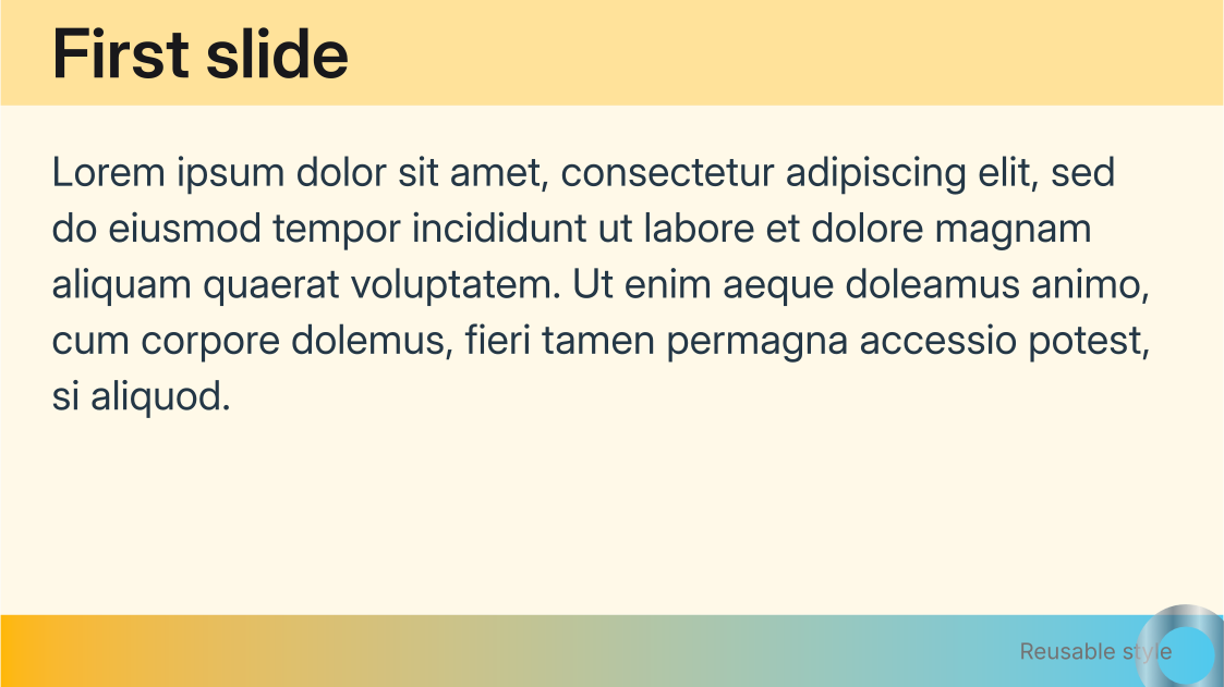
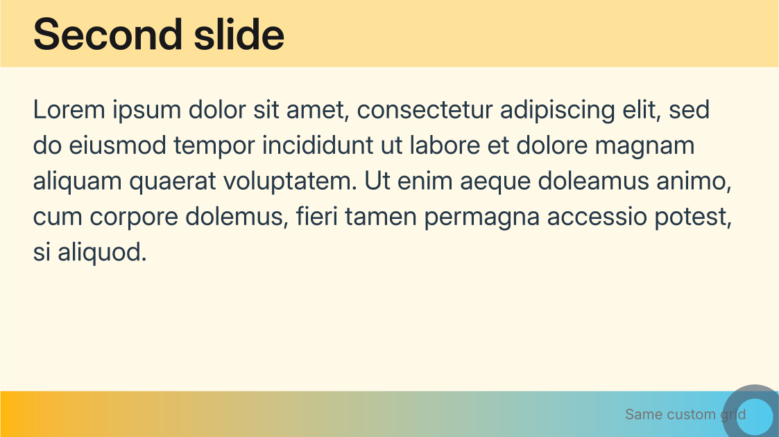
A theme packages this pattern for a whole deck, and writing one is how a look becomes reusable across decks.
Inverting cells by hand
slide(invert: true), described under Inverting one slide, swaps a whole slide’s canvas and text within the palette. When you want finer control, invert selected cells with the same label rules as above. Pair each fill with the text color that reads against it, and apply both halves in the same rule: a set block rule fills the cell’s own block and a neighboring set text colors the content inside it, so a helper that takes a (fill, text) pair can repaint any set of cells:
#import "@local/mosaic:0.0.2" as m
#show: m.setup

// A fill and the text that reads against it are one decision, so bind each
// pair once. Mosaic derives neither half from the other.
#let paper = (fill: rgb("#f4f0e8"), text: rgb("#20262d"))
#let ink = (fill: rgb("#20262d"), text: rgb("#f4f0e8"))

// Paint the named cells with a pair: the `set block` rule fills the cell's
// own block, and the `set text` rule beside it colors the content inside.
#let painted(pair, ..ids) = body => {
  let out = body
  for id in ids.pos() {
    let cell = label("mosaic-cell-" + id)
    out = {
      show cell: set text(fill: pair.text)
      show cell: set block(fill: pair.fill)
      out
    }
  }
  out
}

#let split = m.grids.columns(
  m.grids.track(0.44fr, m.grids.cell("headline", inset: 1.5em)),
  m.grids.track(0.56fr, m.grids.cell("copy", inset: 1.5em)),
)

#let panel(pair, name) = [
  #show: painted(pair, "headline", "copy")
  #m.slide(layout: split, cells: (
    headline: [
      #set align(left + horizon)
      #text(size: 1.6em, weight: "bold")[On #name]
    ],
    copy: [
      #set align(left + horizon)
      One layout, one pair of colors. The same rule that fills the cell also
      sets the fill of the text inside it, so the two never drift apart.
    ],
  ))
]

#panel(paper, "paper")
#panel(ink, "ink")
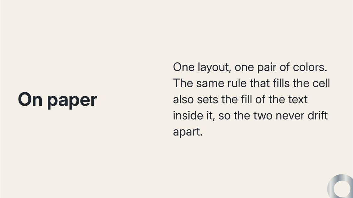
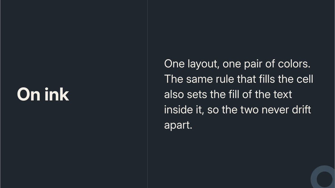
The same helper inverts a single slide, a run of slides, or a whole deck, depending on where you place the #show: rule. Scope it inside a block for one slide, or write it once after m.setup to change the baseline. To invert the full bleed rather than the cells, add #set page(fill: ..); the background and foreground planes take the same rules through the <mosaic-background> and <mosaic-foreground> labels.
Mosaic does not derive the text color from the fill. Two reasons, both practical. Mid-tone grounds sit where an automatic flip is least reliable: a muted sage such as rgb("#aebdb3") reads as “light” to a luminance rule, but white on it measures 1.8:1, well under the 4.5:1 that body text wants. And a cell’s declared fill is often not what the viewer sees behind the text, because an image, scrim, or background plane covers it. Naming the pair keeps that judgment with the author, where a real slide can be looked at.