Reusable card
A card wraps content with matching style in HTML and paged output.
In Typst, #let is your primary building block for reusable formatting and construction. Use it to avoid repeating the same patterns.
#let banner(message, note) = [
#strong(message)
#v(0.3em)
#quote(note)
]
#banner("Reusable functions", "Define UI once and reuse it for many places.")Reusable function in action
“If you update this definition, both call sites update automatically.”
The calepin namespace also includes a compact set of reusable elements for cards, galleries, columns, tabs, and lightbox media. They are designed to demonstrate output-aware patterning in practical notebook websites.
Calepin exposes #calepin.elements.target() to pick content for HTML, static outputs, or a fallback. This example uses colors to make output differences explicit. In Typst 0.15, HTML color output was not fully supported, so HTML branches use explicit CSS via html.elem().
#let html-color-label(body, color) = html.elem("span", attrs: (style: "color: " + color + ";"))[
#body
]
#calepin.elements.target(
html: () => [#html-color-label([#strong("HTML")], "blue") output branch],
paged: () => [#text(fill: green)[#strong("PDF/SVG")] output branch],
fallback: () => [#text(fill: gray)[#strong("Fallback")] output branch],
)The rendered result:
HTML output branch
calepin.elements.card keeps one piece of content boxed consistently across formats.
#let callout = calepin.elements.card[
#heading(level: 3)[Reusable card]
A card wraps content with matching style in HTML and paged output.
]
#calloutcalepin.elements.callout renders AsciiDoc-style admonitions in HTML and paged output. Use kind: with note, tip, important, caution, or warning. The title defaults to the capitalized kind label; pass title: [...] to override it, or title: none to hide the title row.
#calepin.elements.callout(kind: "note")[
Notes highlight neutral supporting information.
]#calepin.elements.callout(kind: "warning", title: [Heads up])[
Warnings flag potential problems before they happen.
]You can also define a project-specific helper with Typst’s .with() method:
#let callout-custom = calepin.elements.callout.with(
kind: "important",
title: [Project note],
)
#callout-custom[
Use a local helper when several callouts should share the same kind and title.
]calepin.elements.sidenote and calepin.elements.sidefigure place supporting material in the margin. In HTML output, the built-in academic theme supports these elements directly and reserves the side column only on pages that use them.
In PDF output, Calepin leaves page geometry under your control. The academic theme connects these elements to marginalia, but it does not automatically reserve a wide outer margin. Add a marginalia.setup rule near the top of the document or in a local theme when you want Tufte-style PDF margins:
#import "@preview/marginalia:0.2.0" as marginalia
#show: marginalia.setup.with(
outer: (far: 8mm, width: 48mm, sep: 6mm),
book: false,
)Use numbering: none for an unnumbered side note.
Text#calepin.elements.sidenote[A margin note.] continues.
#calepin.elements.sidefigure(caption: [A small figure.])[
#image("figure.svg")
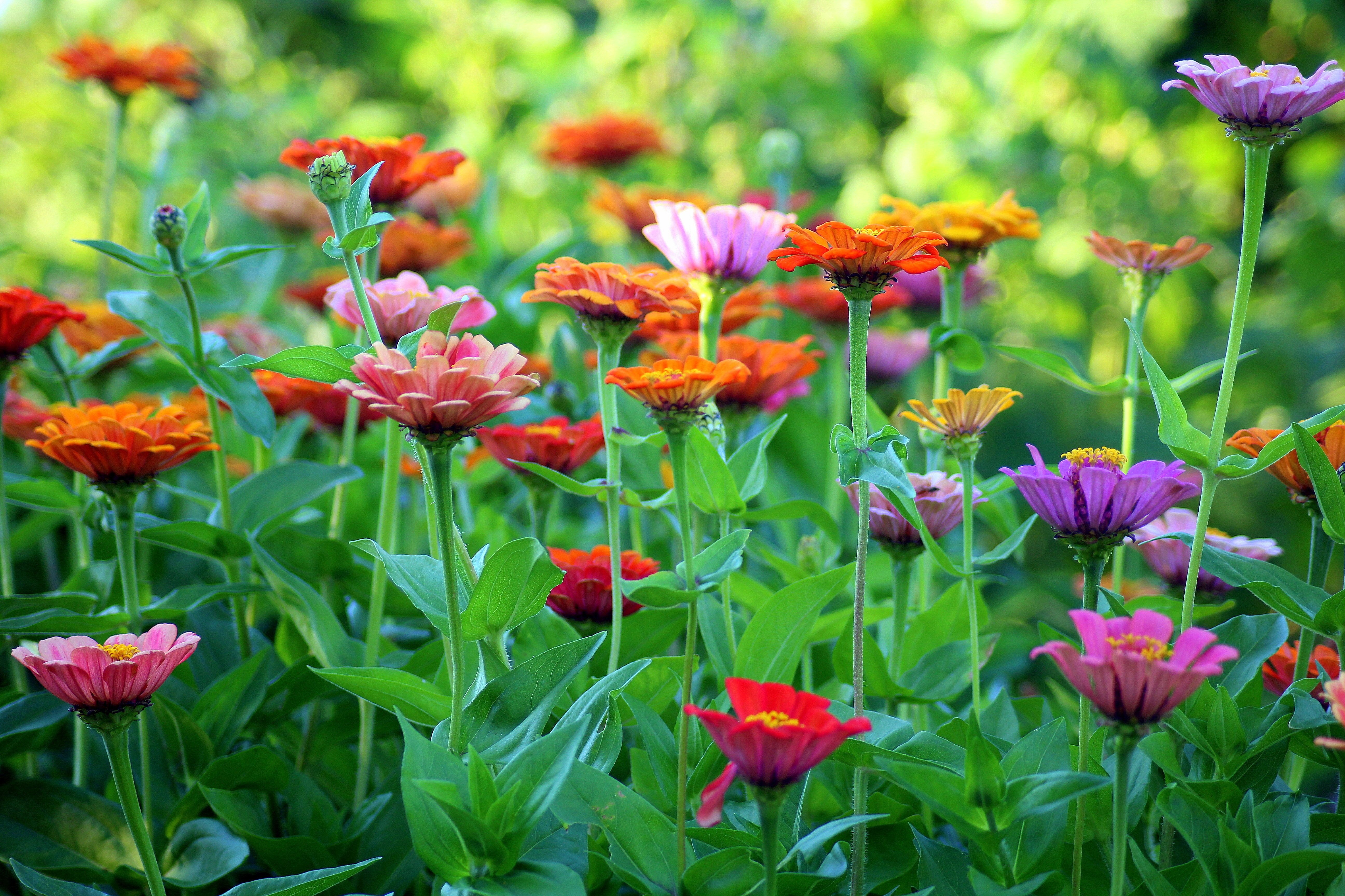
]calepin.elements.gallery accepts image items as tuples or dictionaries and handles local image metadata automatically in static outputs. In HTML output, it can activate lightbox behavior.
#calepin.elements.gallery(
(
("../assets/flowers_01.jpg", "First flower", [First flower]),
("../assets/flowers_04.jpg", "Fourth flower", [Fourth flower]),
("../assets/flowers_02.jpg", "Second flower", [Second flower]),
("../assets/flowers_03.jpg", "Third flower", [Third flower]),
("../assets/flowers_05.jpg", "Fifth flower", [Fifth flower]),
),
columns: 3,
max-width: 42em,
)calepin.elements.columns is output-aware, so the same call produces a plain Pico .grid for HTML and a grid(...) for paged output. Columns are equal-width; pass the paged-output column count as an integer. By default, each item is wrapped in a <div> so plain Typst blocks stay together as one column; use wrap: false when the items already render as standalone HTML elements such as cards.
#calepin.elements.columns(
columns: 2,
wrap: false,
[
#calepin.elements.card[
#heading(level: 3)[Left]
Use an equal-width two-column layout for related content.
]
],
[
#calepin.elements.card[
#heading(level: 3)[Right]
Paged output renders this via Typst `grid(...)`; HTML uses `<div class="grid">` by default.
]
],
)You can also request more than two columns:
#calepin.elements.columns(
columns: 4,
wrap: true,
[One], [Two], [Three]
)calepin.elements.tabs renders Web Awesome tabs in HTML and lists each enabled panel in paged output. Use calepin.elements.tabs[...] as the group and calepin.elements.tab("Label", active: true)[...] for each panel. Panel names are generated automatically; pass name: "..." only when you need a stable custom panel id. Fenced code chunks inside tabs are still discovered and executed.
#calepin.elements.tabs[
#calepin.elements.tab("R", active: true)[
This tab shows R code:
```r
x <- c(1, 2, 3, 4, 5)
mean(x)
```
]
#calepin.elements.tab("Python")[
This tab shows Python code:
```python
x = [1, 2, 3, 4, 5]
sum(x) / len(x)
```
]
]This tab shows R code:
x <- c(1, 2, 3, 4, 5)
mean(x)
[1] 3This tab shows Python code:
x = [1, 2, 3, 4, 5]
sum(x) / len(x)
3.0lightbox-image(...) and lightbox-video(...) produce browser-only interactive media wrappers in HTML while degrading gracefully in paged output.
#calepin.elements.lightbox-image(
"editor-image",
"../assets/screenshot_notebook.png",
"Notebook screenshot",
width: 16em,
)
#calepin.elements.lightbox-video(
"editor-video",
"../assets/calepin_vscode.mp4",
poster: "../assets/calepin_vscode-thumb.png",
width: 16em,
)For lower-level browser-only components, see Custom web elements.